Details
CityPlant showcase - Brand Identity
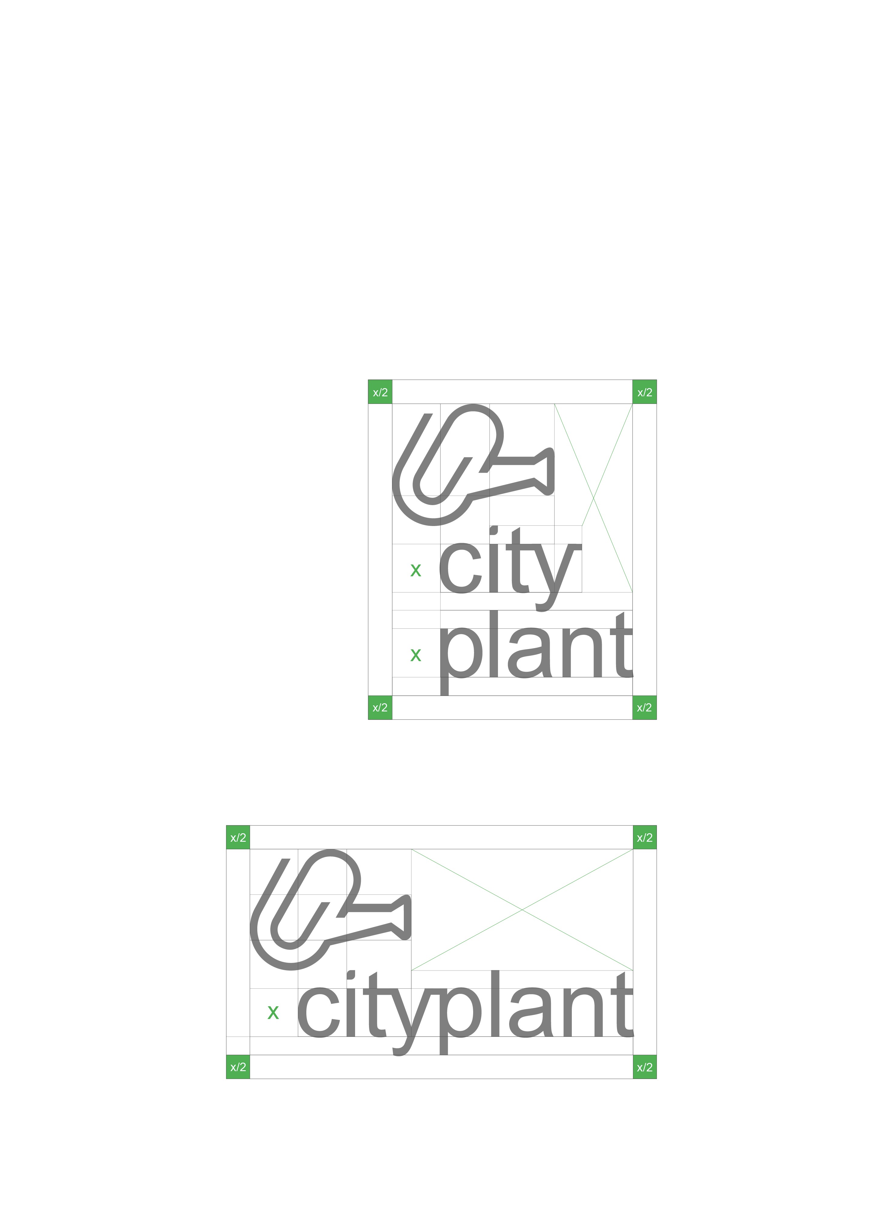
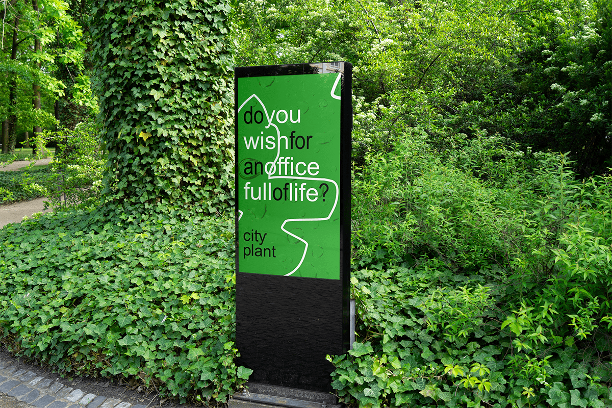
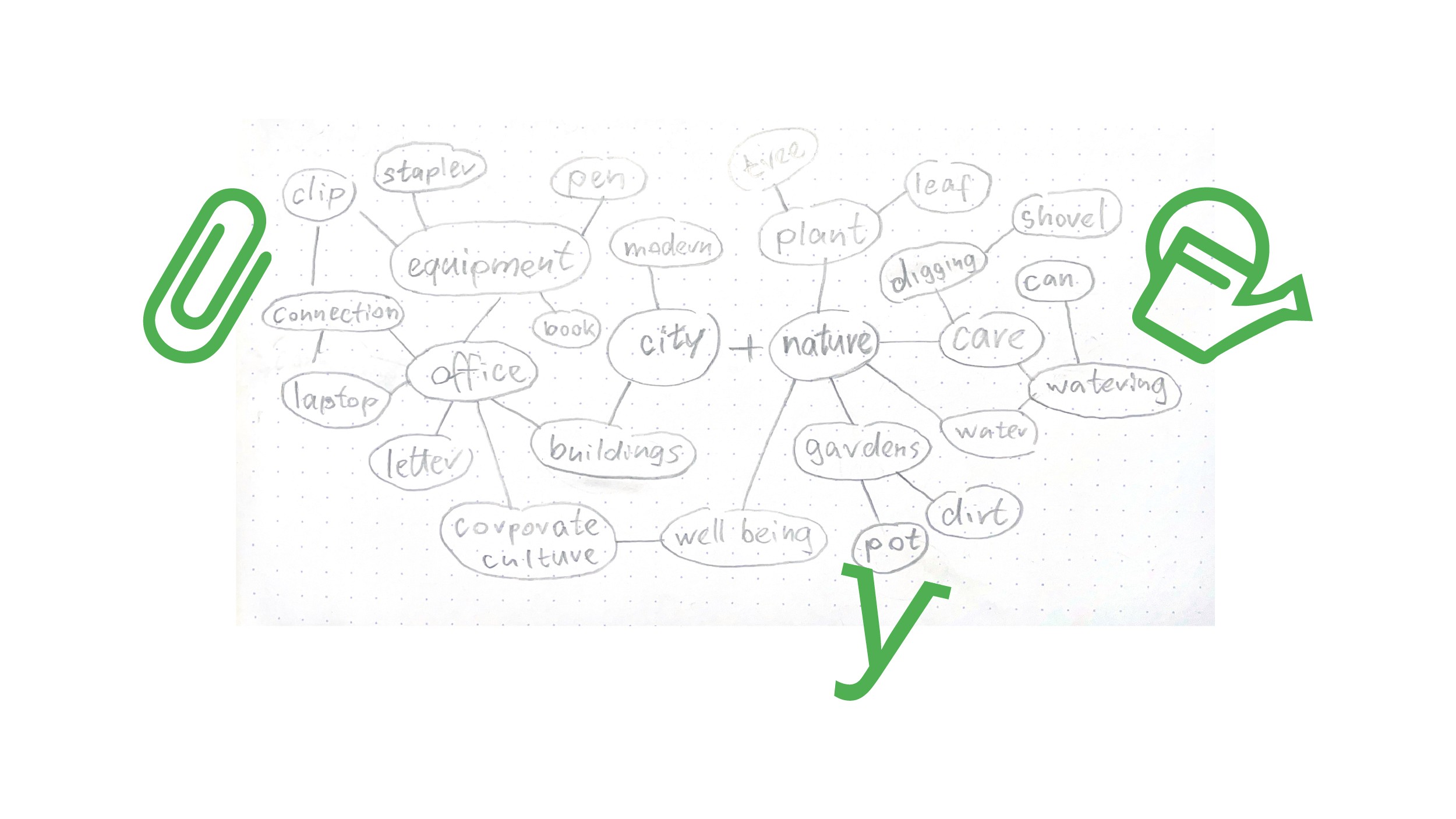
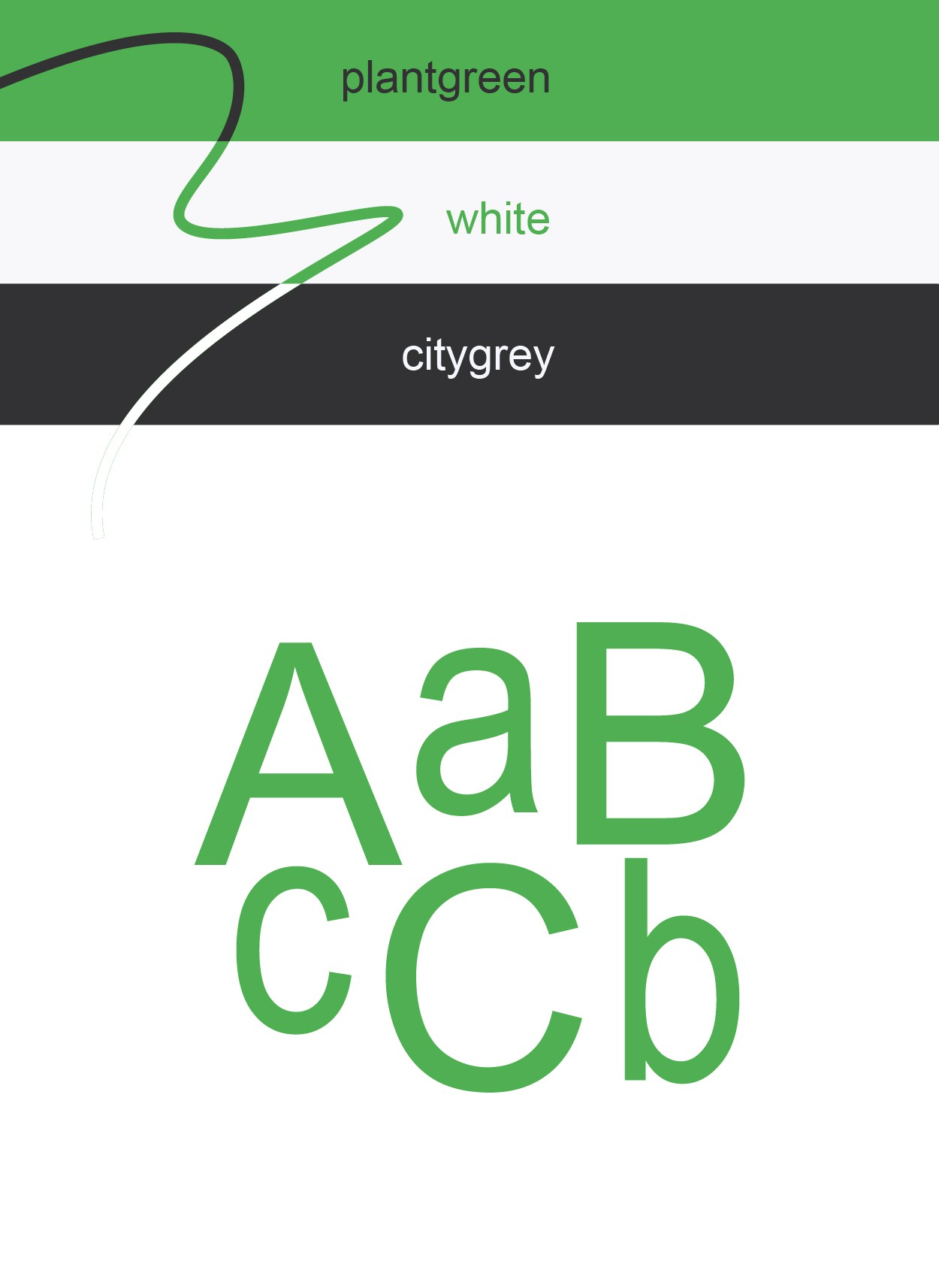
CityPlant designs, installs, and maintains plant displays for offices, restaurants, and hotels. Since 1992, the company has been offering flexible plant rental services and long-term care, bringing the aesthetic and psychological benefits of greenery into indoor spaces. The brand's mission is to create healthier work environments through expert plant care, transforming sterile commercial spaces into welcoming, calming environments where employees and guests feel comfortable. Design challenge Our collaboration with IDsign studio was based on the studio's characteristic symbol fusion methodology, this design approach has become the studio's defining professional practice, which is one of the reasons why CityPlant approached us. The challenge was to combine two different symbolic concepts into a single logo. After writing the brief, the decision was made to use two symbols: a watering can, symbolizing care and active maintenance, and a paper clip, symbolizing the office as a professional environment. The brand's core values: creativity, empathy, playfulness, and expertise, guided the approach, which positioned CityPlant as a professional service provider and a warm, people-centered brand. Visual System The grid-based logomark fuses the watering can with the paper clip into a unified icon that immediately communicates the brand's dual commitment to nurturing growth while maintaining systematic professionalism. The wordmark employs Arial, the universally familiar typeface of corporate offices and digital communication. This deliberate choice reinforces the office environment context: Arial carries the aesthetic weight of decades of workplace correspondence, spreadsheets, and internal memos. By using this ubiquitous typeface, the brand seamlessly integrates into the very spaces it aims to transform, creating visual continuity between CityPlant's professional reliability and the sterile corporate atmosphere that defines so many modern workplaces. Typographic restraint positions the brand as trustworthy and competent without sacrificing warmth. Color Language The palette strategically bridges urban and organic worlds: city grey represents the metropolitan environment and modern commercial space, while vibrant green signals health, growth, and botanical expertise. White grounds the system, evoking cleanliness, clarity, and the fresh air quality that plants provide to office atmospheres. Together, these colors visualize CityPlant's core promise—bringing life into the office! Motion Application The animated sequence opens on a pristine white background, the quintessential blank office screen. The word "city" emerges through a typing animation, characters appearing sequentially as if being typed on a keyboard. The animation then transitions as the logomark activates with a playful watering gesture, visually embodying the brand's philosophy of infusing human care and organic vitality into what begins as sterile, artificially-lit workspace. This progression from digital monotony to animated botanical nurturing distills CityPlant's entire value proposition: transforming the dull reality of office life through thoughtful plant integration and expert care.
Year
2024
Client
CityPlant Plant Décor

Idea